1. The Connection Between Sight and Taste in Culinary Experiences
You spend hours in the kitchen, meticulously seasoning to get the exact flavor right, but your family members eat listlessly, scrolling through their phones while eating? The issue isn't the amount of salt or pepper you added. The human brain decides whether a dish is delicious or not within just 13 milliseconds of looking at it, even before the tongue touches the very first bite.
Gastrophysics proves that: Sight holds absolute control over taste. When the eyes catch a plate with vibrant contrasting colors, a neat composition, and a glossy sheen from the sauce, the cerebral cortex immediately sends signals to stimulate salivary glands, release digestive enzymes, and boost dopamine levels. Conversely, even an extraordinarily delicious dish that is presented chaotically or with dull colors will cause the brain to label it "unappealing," automatically dampening the diner's appetite.
"We eat with our eyes before we eat with our mouth. Sight doesn't just predict flavor; it directly creates and alters the structure of taste in the brain."
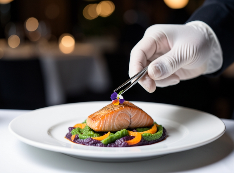
Many people mistakenly believe that the art of plating is a luxury reserved exclusively for 3-star Michelin restaurants with edible flowers held by tweezers or artistic sauce swipes. This is a completely flawed mindset that inadvertently lowers the quality of daily life. Applying visual language to family meals costs no extra money and takes no extra cooking time, yet brings back exponentially greater emotional value.
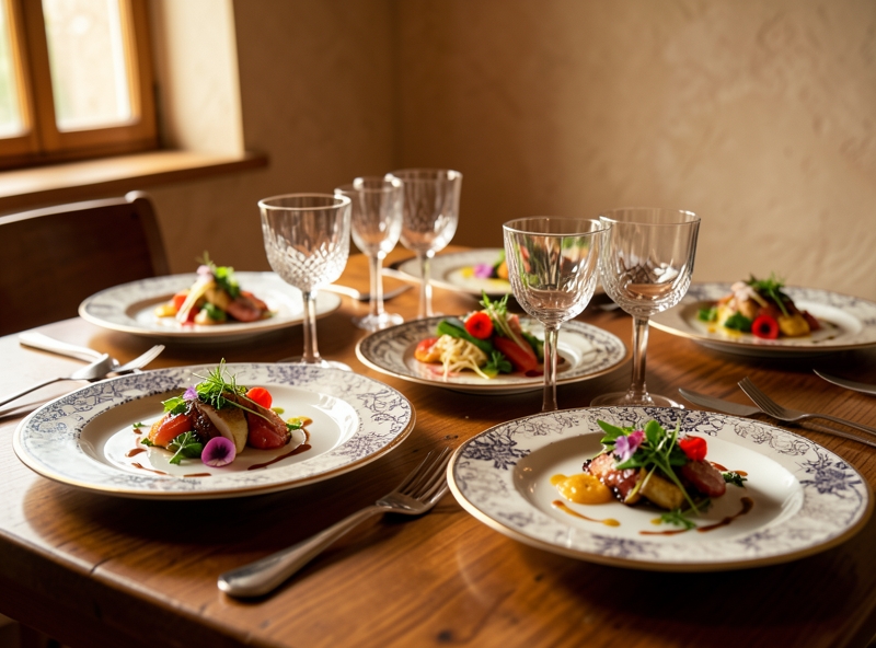
The difference between a meal meant just to "get it over with" and a sensory-stimulating culinary experience actually comes down to a few simple styling techniques:
| Visual Element | Standard Plating | Elevating the Visuals (Upgrading the Experience) |
|---|---|---|
| Color Balance | Monochromatic, dull-colored after cooking (protein-heavy, lacking greens/reds). | Apply the rule of 3 colors (Dominant - Contrast - Accent) using fresh vegetables, chili, and scallions. |
| Composition | Food piled up in the center of the plate, overflowing the rims, with mixed sauces. | Create negative space occupying 30% of the plate area; layer food to add height. |
| Tableware | Using elaborate patterns or colorful plastic plates that cause visual distraction. | Prioritize monochromatic ceramic plates (white, black, gray) so the dish becomes the absolute hero. |
When you change how you present your food, you are sending a subtle message of deep care and respect to those sitting across from you. A neatly plated dish of braised fish, accented with a few slices of bright red chili and lush green dill sprigs, not only brightens up the dining table but also compels family members to put down their phones to take a look. An awakened sense of sight brings full focus to the meal.
To start upgrading your family's taste experience today, apply these 3 golden rules of food presentation right away:
- Add height to the dish: Instead of spreading food flat on the plate, stack it upward. Height creates spatial depth and a sense of abundance and elegance.
- Harness the natural shine of oil and sauce: A light brush of olive oil or glossy sauce over grilled meat before serving will immediately trigger the salivation reflex.
- Respect the cleanliness of the plate rim: Always use a clean towel to wipe away any sauce splatters on the rim of the plate. This attention to detail creates a crisp visual boundary, allowing the dish to stand out like a work of art.
Don't turn family meals into a monotonous energy-fueling routine. By mastering the connection between sight and taste, you don't just become a good cook—you officially become an artist of emotions, turning every everyday meal into a place of deep family bonding.
2. Color Pairing Rules: A Palette That Stimulates the Taste Buds
A perfectly seasoned, well-balanced dish, yet viewers still scroll past your image in 0.5 seconds? The reason is simple: the human brain processes color before the tongue tastes flavor. The wrong color combination will turn an expensive dish into a bland block of food, completely killing the appetite. To retain viewers and convert them into customers, you must captivate their vision with a color strategy backed by neuroscience.
Color in cuisine isn't just decorative; it acts as a biological signal that directly impacts the hypothalamus—the organ controlling hunger. Understanding how color palettes work will help you immediately trigger the emotions and physiological responses of your diners.
- Warm Color Group (Red, Orange, Yellow): The driver of instant hunger. Red slightly increases heart rate and blood flow, sending a signal of "delicious and energy-rich." Yellow recalls crispy textures, the rich creaminess of butter, cheese, or a perfectly baked crust. Orange stimulates the digestive system to secrete gastric juices, creating intense cravings.
- Green: A sign of freshness, safety, and healthiness. A splash of green from herbs, thyme, or broccoli cuts through richness, offering flavor balance and an implicit promise of fresh ingredient quality.
- Caramel Brown & Golden Yellow: An affirmation of the Maillard reaction—the gold standard for rich flavor, umami, and perfect doneness in fried, seared, or roasted dishes.
| Color Group | Neurological & Psychological Impact | Practical Plating Application |
|---|---|---|
| Red - Orange - Yellow | Stimulates heart rate, increases gastric secretions, triggers intense appetite. | Used for chili sauce, tomato sauce, crispy breading, juicy fruits. |
| Fresh Green | Creates a sense of safety and freshness, reducing grease heaviness (fat fatigue). | Used for herb oils, decorative greens, chimichurri sauce, vegetable garnishes. |
| Caramel Brown | Triggers flavor memories of crispiness, richness, and the bold savory taste of grilled meat. | Creates precise sear marks on steaks, roasted chicken, and toasted bread. |
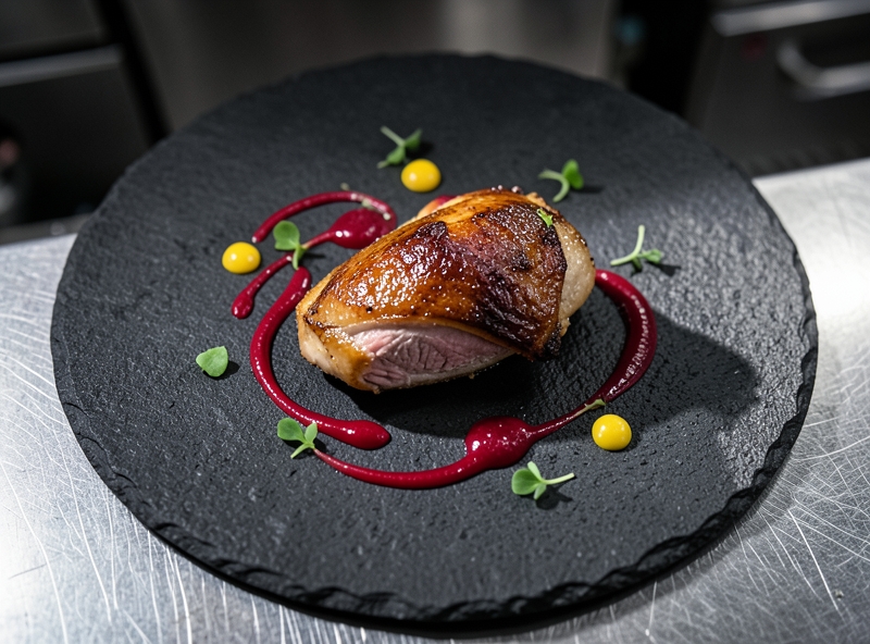
Having the right color palette is just the beginning. The real magic lies in the visual contrast between three elements: the main ingredient, the sauce, and the plate color. Apply the 3-layer contrast formula below to transform your dish into a highly persuasive masterpiece:
1. Plate Rules - The Contrast Background (The Canvas): White ceramic plates are a safe choice to highlight vibrant sauces (red, deep green). However, black slate or dark ceramic plates serve as a "secret weapon" to create incredible depth, making the golden crust of fried foods or the vivid red of seared beef pop instantly.
2. Sauce - The Connecting Color Band: Never smother food in sauce until it disappears. Use techniques like swooshes, dots, or delicate drizzles instead. If a meat dish has an overwhelming dark brown tone, a swoosh of deep red raspberry sauce or vibrant green parsley oil across the plate instantly breaks the monotony, drawing eyes right to the centerpiece.
3. The 60 - 30 - 10 Color Ratio: Culinary color pairing follows high-level design principles. 60% goes to the dominant color of the main dish (meat, fish, carbs); 30% to secondary colors from side vegetables; and 10% to absolute contrast from the final touch (microgreens, bird's eye chili, or edible flowers). This ratio creates perfect balance, making the dish look premium while maximizing appetite appeal.
"Diners eat with their eyes before touching their spoons. A delicious dish lacking color merely stops at providing sustenance; a visually stimulating color scheme is the true ticket that takes diners on a luxurious experiential journey."
3. The Golden Ratio and Geometric Structure on the Plate
A gold-leaf Wagyu beef tenderloin or a slice of fresh Norwegian salmon can be turned into a disastrous dish if placed flat and messily on the plate. The factor that distinguishes a "home-cooked meal" plate from a Fine Dining masterpiece lies not in the cost of the ingredients, but in the mindset of spatial architecture. When you master the golden ratio and 3D structuring techniques, you are not just serving food—you are guiding the psychology and stimulating the palate of your guests right from the first glance.
Modern presentation thinking requires a perfect blend of visual mathematics and nutritional science. To turn every plate into a work of art capable of driving behavioral conversion (from admiring to intense craving), apply the exact geometric structure below.
1. The 1/2 - 1/4 - 1/4 Golden Ratio: A Matrix of Nutritional and Aesthetic Balance
Don't arrange elements randomly. The human eye automatically seeks order in colors and shapes. Divide the plate surface into 3 strategic zones:
- 1/2 Plate for Vegetables & Fiber (Visual Anchor): This is the zone that creates the dominant colors. Use roasted vegetables, salads, or purees to cover half of the plate. This zone serves as a foundation, bringing freshness and reducing visual heaviness from protein elements.
- 1/4 Plate for Protein (Focal Point): The protein block (beef, fish, poultry) is the "star" of the plate. Position the protein at the visual focal point, typically the intersection between the vegetables and starches, where the light hits the most.
- 1/4 Plate for Complex Starches (Foundation): Risotto, mashed potatoes, or grains. This component acts as a solid base, supporting the protein or connecting color blocks.
2. 3D Structuring Techniques: Stacking and Layering (Creating Height for the Dish)
Most amateur cooks make a severe mistake: spreading everything evenly on a 2D flat plane. A flat plate is a "dead" plate. To create impact, you must incorporate height into the design using two foundational techniques:
- Layering (Base Layering): Pour a sauce mirror layer or swipe a puree swoosh firmly onto the plate surface. Next, place the starch component (such as mashed potatoes) on top as a support base. This technique creates depth and prevents upper components from shifting.
- Stacking (Vertical Stacking): Place the protein portion on top of the starch base, then finish with microgreens, tuiles (decorative crisp wafers), or dehydrated leaf veins at the highest peak. The golden rule: The bottom layer must be the widest and sturdiest, while the top layer must be the lightest and most delicate.
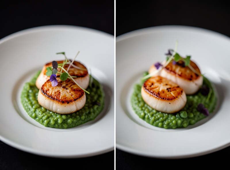
3. The Rule of Odds and Focal Point Techniques
Why 3 or 5, and never 2 or 4? The human brain is naturally drawn to asymmetry. Even numbers of elements (such as 2 pieces of shrimp) create static symmetry, causing the diner's eyes to scan past quickly and feel bored. Conversely, 3 or 5 components force the eyes to move continuously between points, creating dynamic kinetic energy on the plate.
To create a captivating Focal Point, apply maximum contrast techniques:
- Color Contrast: Place a drop of vibrant red chili oil against a backdrop of jade-green pea puree.
- Texture Contrast: Combine the smoothness of a sauce layer with the crunch of seared fish skin or toasted seeds.
"A flat plate is a dead painting. When you raise the height of the ingredients by even just 1.5 cm, you awaken the diner's primal instinct to explore."
The summary table below will help you immediately standardize your plating techniques:
| Structural Element | Common Mistake (Amateur) | Technical Standard (Professional) |
|---|---|---|
| Spatial Layout | Spreading ingredients evenly across the entire plate surface (2D). | Allocating 1/2 vegetables, 1/4 protein, 1/4 starch with negative space. |
| Height | Placing protein and vegetables side by side on a flat plane. | Using Stacking: Sauce > Starch > Protein > Microgreens (Creating 3D volume). |
| Component Quantity | Placing 2 or 4 protein pieces, creating a rigid symmetrical feel. | Applying the Rule of Odds: Placing 3 or 5 pieces to create visual rhythm. |
| Garnish Sauce | Drizzling sauce over everything, ruining the food's crispness. | Creating a base (sauce mirror) or adding focal accents (dots/drizzle) around the center. |
Proactively controlling the plate space means mastering the culinary experience. By accurately applying the golden ratio, utilizing height, and guiding the gaze with the rule of odds, you immediately elevate the value of the dish, turning every recipe into a priceless artistic experience.
4. The Art of Negative Space: Elegance Through Simplicity
Have you ever spent hours meticulously preparing a perfect dish, only for it to look like a heaped cafeteria meal when plated? Most cooks make the same classic mistake: cramming too many ingredients out of fear that the plate will look "empty." In fine dining culinary plating design, negative space is not wasted real estate—it is a visual weapon that defines elegance.
Negative Space acts like the pauses between musical notes. If every sound played simultaneously at full volume, all you would get is noise. Similarly, a plate covered from center to rim overwhelms the eyes. When you intentionally leave breathing room, the diner's focus is immediately drawn to the focal point—where a perfectly seared steak or a piece of pan-seared salmon shines.
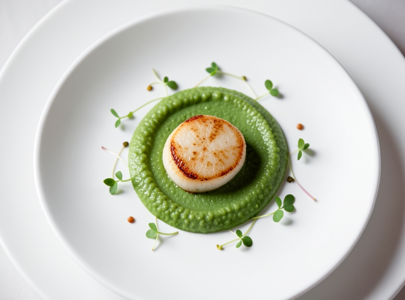
To master the art of space control and transform your plate into a 5-star dining experience, you need to memorize these three core principles:
- The 60/40 Rule: Ideally, use at most 40% to 50% of the plate's surface area for food. The remaining 50–60% must be pure negative space. This ratio creates ideal contrast, making the colors and shape of the food stand out crisply.
- The Plate is a Canvas: Choose a plate size that is 30% larger than the actual portion. If your cut of meat is 8cm long, the inner diameter of the plate should be at least 24–28cm. Using a plate that is too small is the fastest way to make a dish look messy.
- The Rim is Sacred Ground: The rim exists to frame the culinary artwork, not to hold food. Keep the rim completely pristine—free of sauce smudges, scattered pepper, or stray garnishes.
| Plating Element | Standard Plating (Lacks Space) | Fine Dining Standard (Optimized Space) |
|---|---|---|
| Plate Coverage Ratio | 80% - 100% (Fully covered, piled high) | 30% - 50% (Focused centerpiece, leaves breathing room) |
| Visual Impact | Heavy, cluttered, looks cheap | Refined, airy, elevates perceived value |
| Rim Handling | Sauce and crumbs spill over to the edge | Rim stays clear with a 2–3cm buffer, wiped spotlessly clean |
Wiping the plate is the final step, yet it defines the overall professionalism. Before serving, use a clean microfiber cloth dampened with a little white vinegar or warm water to thoroughly wipe away any water spots, fingerprints, or grease splatters on the rim. This attention to detail marks the clear boundary between an amateur cook and a true culinary professional.
"The elegance of a dish does not lie in how many ingredients you manage to crowd onto the plate, but in the refined breathing room you thoughtfully allow it."
Start practicing today: scale down the portion, switch to a larger flat white porcelain plate, and let the space speak for itself. You will be amazed at how the same familiar recipe takes on a completely new look—luxurious, sophisticated, and undeniably captivating.
5. Transforming a Vietnamese family meal into a work of art
You spend 2 arduous hours in the kitchen, but when served, the meal still looks dull and cold? The truth is: 80% of the taste experience starts with visual appeal. No complex 5-star restaurant techniques needed—with just 3 small shifts in your presentation mindset, an everyday meal will instantly turn into a captivating work of art.
1. Turn familiar herbs and aromatics into visual "weapons"
Scallions, cilantro, and chili peppers aren't just for seasoning. They are the final brushstrokes that complete the culinary canvas when used correctly:
- Curled scallions: Shred scallion stems razor-thin lengthwise, then drop them immediately into an ice water bath for 5 minutes. The strips will naturally curl up, creating volume and a crisp, eye-catching look when placed on stir-fries or steamed fish.
- Fresh chili sliced at a 45-degree angle: Instead of cutting thick round rings, thinly slice the chili diagonally. This angle reveals the vibrant red color and seeds, creating depth and elegant lines on the dish's surface.
- Off-center cilantro: Break the habit of scattering cilantro haphazardly. Gather them into 1-2 small, fresh clusters and place them off-center to create visual breathing room, letting the main dish shine.
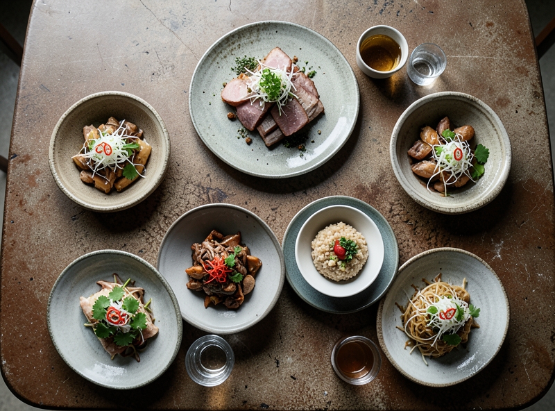
2. Choose ceramic dishware: The "picture frame" that honors the food
The most common mistake is using brightly patterned plastic plates that overpower the natural colors of the food. Switching to rustic ceramics or reactive glaze pottery in muted earth tones creates a complete aesthetic breakthrough.
| Dish | Optimal Dishware Style | Visual Effect |
|---|---|---|
| Rich braised dishes (Braised pork, braised fish) | Unglazed or raw-glazed ceramic plates/bowls in cream or off-white | Creates strong contrast, highlighting the glossy amber color |
| Stir-fried or boiled vegetables | Matte black, titanium gray, or dark moss green ceramic plates | Enhances vibrant jade green tones and boosts the juicy appearance |
| Soups and stews | Deep bowls with an ocean blue reactive glaze | Adds inviting depth, showcasing cleverly arranged ingredients |
3. Secrets to keeping dishes piping hot despite presentation time
The biggest pain point when carefully plating food is having it turn cold before serving. The following two golden rules will solve this problem entirely:
- Pre-heating dishware: Rinse plates/bowls with boiling water or microwave them for 30 seconds before plating. Warm dishware keeps food hot for an extra 15 to 20 minutes.
- "Prep first, plate second" technique: Prepare all garnishes, carved peppers, and sauces on a separate tray beforehand. As soon as the dish leaves the hot pan, it takes less than 15 seconds to place the prepared elements on top, rather than figuring it out while plating.
"Delicious food satisfies physical needs, but beautiful food feeds the soul. Don't let your kitchen be a place of haste—turn every plate into a complete culinary experience."
6. Frequently Asked Questions (FAQ)
The gap between a restaurant-quality dish and a clumsy dining disaster often lies in tiny technical details. Below are in-depth answers to the most practical concerns, helping you master the art of presentation while preserving peak flavor.
Q1: How can I plate food beautifully without letting it get cold?
This is a classic battle between visual aesthetics and serving temperature. A dish losing 10°C can drop up to 40% of its original flavor as fats congeal and sauce structures alter.
To thoroughly solve this issue, apply these 3 "thermodynamic" rules in professional culinary plating:
- Pre-heat plates before plating: Rinse plates with hot water or place them in an oven at 60°C–70°C for 3–5 minutes. A warm plate will keep your food warm for an extra 10–15 minutes.
- Precise "Mise-en-place" process: Prepare all garnish ingredients (herbs, toasted seeds, garnishing veggies) on a separate tray before the food leaves the pan. All plating actions must be completed within 45 seconds.
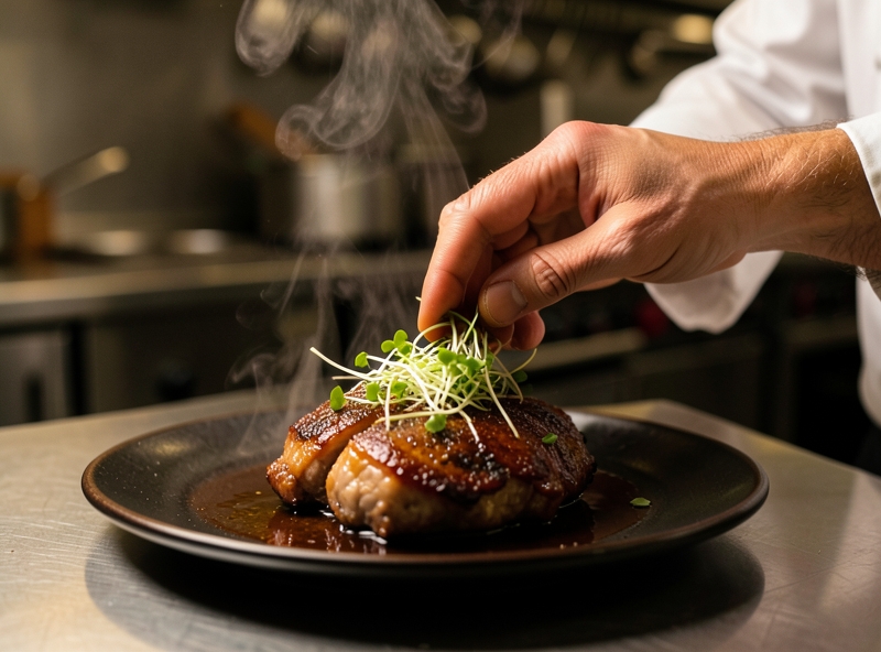
- Tableside sauce drizzling tactic: Plate the piping hot protein and vegetables first, bring them to the table, and then pour the steaming hot sauce over them. This technique creates a premium visual effect while keeping the dish perfectly hot.
"Temperature is the invisible soul of a dish. Masterful plating is not about extending preparation time, but optimizing serving speed."
Q2: Should patterned dishware be used for everyday meals?
Vibrant patterns are a "double-edged sword." Plates with overly busy patterns easily create visual noise, obscuring the natural features of the food.
However, you don't necessarily have to eliminate them completely. Apply the Contrast Combination Principle based on the dish's characteristics:
| Dishware Type | Compatible Dishes | Dishes to Avoid |
|---|---|---|
| Intricate Patterns / Multicolor | Monochromatic dishes with minimal textures (White rice, steamed tofu, steamed ginger fish). | Mixed stir-fries, colorful salads, dishes with thick, dark sauces. |
| Plain White / Neutral Tones (Matte) | All dishes, especially those with vibrant colors and complex sauces. | Pale-colored dishes without garnishing greens. |
Expert advice: For daily use, opt for dinnerware sets in earth tones, ceramic gray, or ivory white with a matte finish. They create a cozy feel while fully showcasing the natural colors of the food without being distracting.
Q3: How to subtly present traditional braised dishes or soups/noodle dishes?
Richly braised dishes or soups are often labeled as "unrefined" due to dark sauce colors, oily scum, or messy mixed ingredients. Turn this weakness into a strength using structural layering techniques:
- For richly braised dishes:
- Separate sauce and add glaze: Do not dump the entire braising pot onto the plate. Remove the meat or fish first, reduce the sauce on the stovetop until thickened, and then gently drizzle a thin layer over the surface to create an enticing sheen.
- Create negative space: Use a dark deep-rimmed plate. Gather the main ingredients in the center of the plate, leaving a rim boundary of at least 3 cm. Accent with a few thin chili slices and shredded scallions to create contrast.
- For soups and noodle dishes:
- "Base first, broth later" technique: Separate solid ingredients (noodles, meat, greens) and broth. Arrange solids neatly in a deep bowl. Gently pour hot broth around the inner rim of the bowl to avoid disturbing the arranged ingredients.
- Skim fat and foam: Use a ladle to skim off excess foam and surface fat before ladling broth into the bowl. Clear, translucent broth is the gold standard of elegance.