1. Biophilic Design and the Power of Color in Healing Spaces
Have you ever wondered why standing before a lush green forest or sitting by a trickling stream makes us feel so instantly calm? In reality, deep within human DNA from millions of years ago, we inherently belong to nature. The concept of Biophilic design was born not just to create houses that "look pretty," but to mend the broken connection between modern humans and the natural world.
Imagine your home is no longer just soulless concrete walls, but a living entity. There, Biophilic design goes beyond placing a few potted plants in a corner. It is how we bring the breath of the earth, sun, and wind into every corner of our daily lives. When living in such a "breathing" space, our bodies automatically activate self-healing mechanisms.
The key to the power of Biophilic design is color. Scientific studies have shown that tones inspired by nature have the ability to directly affect the endocrine system. Instead of harsh artificial colors that keep the nerves in a state of "alarm," natural shades significantly help reduce cortisol levels (the stress hormone) in the blood.
"Color is not just something we see with our eyes; it is something we feel with our soul. A patch of moss green or earthy brown wall can soothe a weary mind more effectively than any words of comfort."
To help you visualize how color "heals" us, take a look at the comparison table below between modern industrial colors and Biophilic colors:
| Color Group | Feeling Provided | Biological Impact |
|---|---|---|
| Green (Sage, Moss) | Freshness, growth | Reduces heart rate, relaxes muscles |
| Blue (Sky, Ocean) | Tranquility, vastness | Lowers blood pressure, improves sleep |
| Earth Tones (Terracotta, Sand) | Stability, safety | Creates a sense of protection, reduces anxiety |
Applying Biophilic design to urban apartments sometimes starts with very small changes that bring about massive visual and psychological effects:
- Use wall paints with "muted" tones like blue-grey or creamy white instead of pure white to soothe the eyes.
- Maximize natural light through thin curtains, creating shadow effects of plants on the floor every afternoon.
- Prioritize surface materials with raw textures like wood, stone, and rattan to awaken the sense of touch.
When you skillfully combine these elements, the home will no longer be a place to "survive" after 8 hours of stressful work, but truly become a restorative "oasis." It is where you can shed all pressure outside the door, take a deep breath, and feel the embrace of Mother Nature's purest colors.
2. Discover the core Biophilic color palettes that soothe the soul
Have you ever wondered why, when standing in the middle of an old forest or sitting before a deserted beach, your heart suddenly feels as light as if a heavy burden has been lifted? It’s not a coincidence. Mother Nature possesses a miraculous therapeutic "color palette" that architects call the Biophilic color system. Instead of choosing paint colors based on trends or "doing what the neighbor's house looks like," I want to tell you about how these shades profoundly affect our heart rate and breathing.
First, let's talk about Green – the soul of life. Don't imagine jarring neon greens; think of the color of mossy leaves after the rain or the deep green of ancient tree canopies. In color psychology, green has an incredible ability to regenerate energy. It acts like a "tonic" for the vision, helping to reduce eye strain after hours of staring at computer screens. When you bring this shade of green into your living room or workspace, you'll feel your breath deepen, and your mind open up, ready for new ideas.
If green is life, then Blue is the harbor of tranquility. Choose the color of the sky at dusk or the deep teal of the ocean. This color palette has a special power: slowing the heart rate and lowering blood pressure. I often advise friends who have trouble sleeping to try painting a muted blue accent wall in the bedroom. It’s like a soothing whisper: "Everything is okay, it's time to rest," helping the mind escape the anxious loops of daily life and financial stress.
And it would be a mistake to overlook Earth tones such as wood brown, beige, or terracotta. These are the shades that provide the greatest sense of security and stability. Remember the feeling of touching a rough tree trunk or walking barefoot on sand. These colors create a "psychological anchor," helping us feel protected and as though we belong to a fixed place amidst this fast-turning world.
"Color in a living space is not just for looking at, but for feeling. A true home must be a place where the moment you step through the door, all the storms outside stop behind the wall paint."
However, the secret to achieving the best healing effect lies not only in which color you choose, but in the Saturation you select. This is where I see many people make mistakes:
| Saturation | Feeling Provided | Usage Advice |
|---|---|---|
| Vivid | Stimulating, dynamic, and full of energy but can easily cause eye fatigue if used over large areas. | Should only be used for small decorative items, throw pillows, or artwork to create accents. |
| Muted/Dusty | Gentle, sophisticated, creating a sense of relaxation and true "healing." | Priority for large wall sections, curtains, or area rugs to envelop the space. |
My practical experience shows that you should prioritize "muted" tones – colors that are mixed with a bit of grey or brown. Instead of a vibrant green, choose sage green. Instead of a bright orange, choose a deep terracotta. These shades don't "shout" at you; they gently whisper, allowing the nervous system to truly rest. When that happens, the house is no longer just four inanimate walls, but becomes a living entity embracing and soothing your soul every day.
3. The Art of Combining Color with Light and Natural Materials
Have you ever sat in your living room in the late afternoon, watched the day's final rays of sunlight stretch across a moss-green wall, and suddenly felt a strange sense of peace? That isn't a coincidence. In interior design, color never stands alone. It is like a living entity, constantly "conversing" and transforming according to the movement of light and the surfaces of the materials it covers.
When applying Biophilic design, color serves as an emotional "bridge." Imagine earthy tones like clay brown, stone grey, or soft greens. In the morning, when the bright dawn light hits, these colors look incredibly pure and full of energy, helping you wake up to start a new day. But as dusk falls, under the warm golden-orange light, that same wall becomes contemplative, deep, and soothing to the mind after a long, stressful workday. That is the magic of choosing the right paint color that interacts with sunlight.
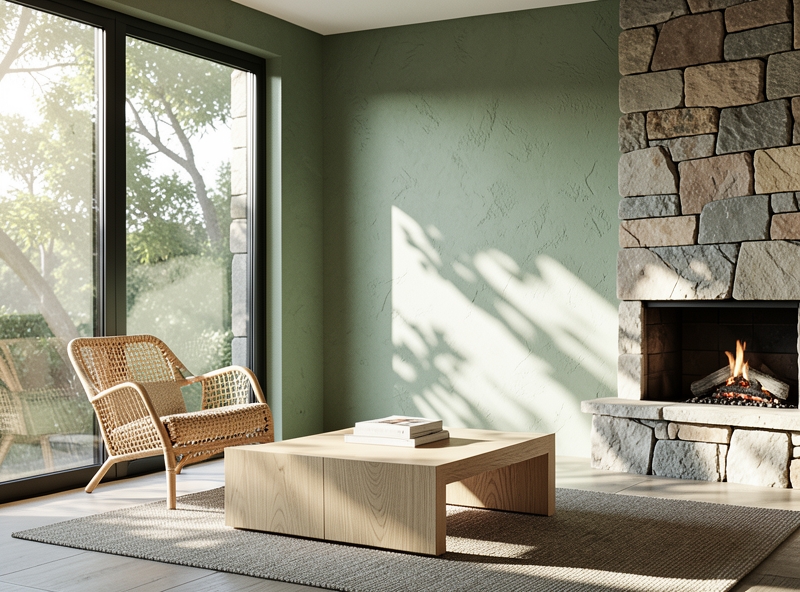
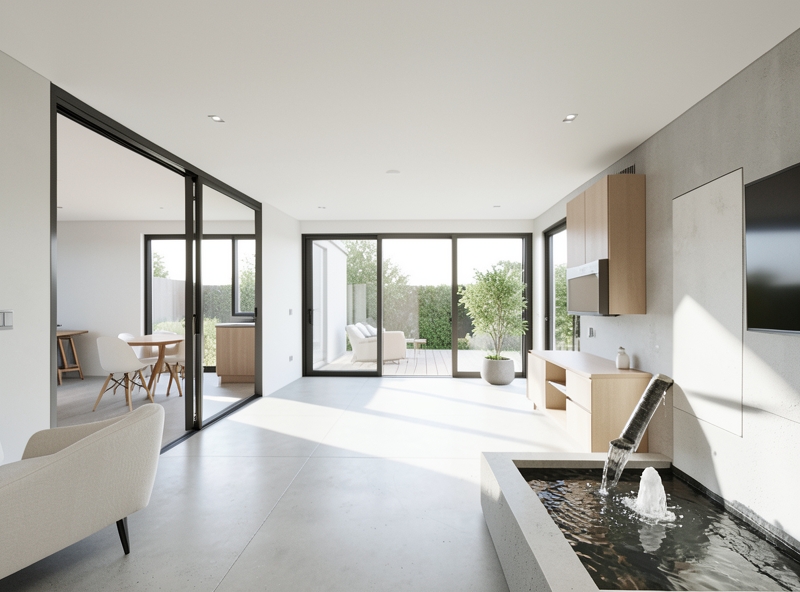
But if there were only color and light, the house would still lack a "soul" – that is the resonance of touch. A beige wall becomes soulless if placed next to glossy, lifeless industrial materials. But try placing it next to an oak shelf with its raw grain intact, or a handcrafted rattan chair, and you will see the difference immediately. Wood, stone, rattan, or linen are not just materials; they carry within them the stories of nature.
This combination creates a visual effect that I often call the "vibration of materials." Paint fills the gaps, while wood and stone create inspiring touchpoints. To help you better visualize this coordination, refer to the suggestion table below:
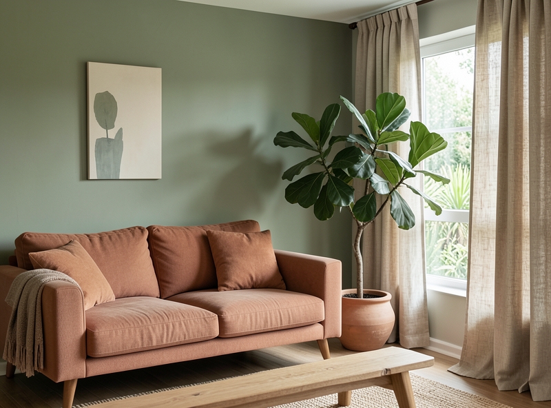
| Dominant Color Tone | Accompanying Materials | Spatial Effect |
|---|---|---|
| Sage Green | Light oak, rattan | Brings a fresh, relaxing feeling like being in an early morning garden. |
| Terracotta | Marble, raw linen fabric | Creates warmth, stability, and a rustic beauty close to the earth. |
| Stone Grey | Dark walnut wood, black metal | Evokes the luxury, stillness, and depth of natural caves. |
"A true home is not just a place to shelter from the rain and sun, but a place where every time you touch a tabletop or look at a wall, you feel yourself reconnecting with nature."
My advice to you is: don't be afraid to experiment. Take a linen swatch, a small piece of wood, and hold them against the wall you plan to paint. Observe them at different times of the day: in the bright 10 AM light and at 5 PM twilight. Only when you see them "blend" together under all angles of light have you found the perfect symphony for your home. The combination of natural colors and organic materials doesn't just beautify the house; it nurtures the inhabitant's soul in the most silent of ways.
4. Color Theory and Practical Applications for Each Functional Room
When I first started dabbling in redecorating my small home, I was like many others—whenever I saw a beautiful color, I wanted to "bring" it all into the room. The result was a space that looked no different from a poorly mixed palette. Later, when I delved deeper into Biophilic design—a design philosophy that breathes nature into life—I realized the 60-30-10 rule. Think of it like putting together a well-tailored outfit: 60% is the background color (like the suit), 30% is the secondary color (the shirt), and the final 10% is the subtle accent (the tie or pocket square).
"Color in Biophilic style is not just to be seen, but to be felt. It is how we trick our vision into believing we are standing in a sparse forest or lying on fine sand, even though we are actually on the 20th floor of an apartment building."
In Biophilic philosophy, we don't choose colors randomly. Every hue originates from nature: the colors of earth, stone, sky, and leaves. Let me tell you how to apply this 60-30-10 framework to each specific living space.
| Space | 60% - Dominant (Background) | 30% - Secondary (Furniture) | 10% - Accent (Decor) |
|---|---|---|---|
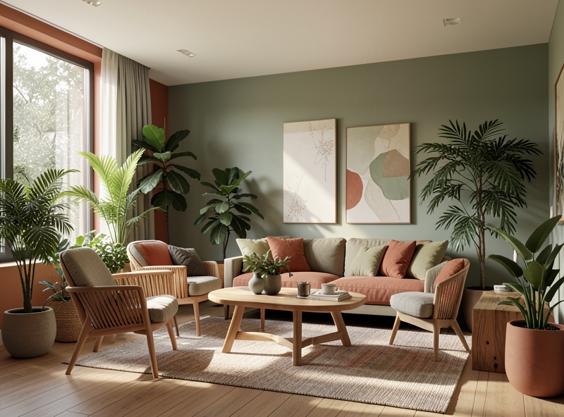
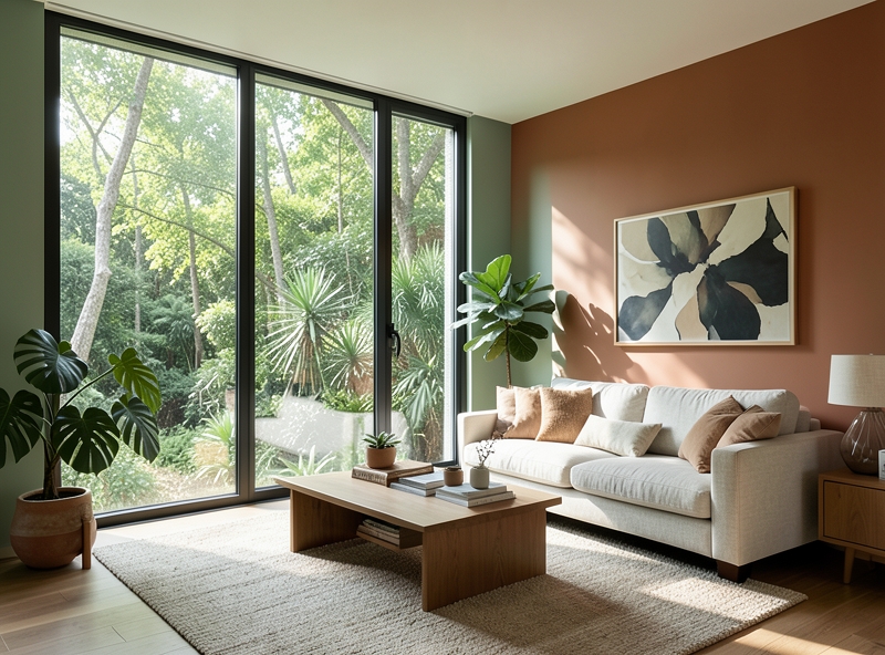
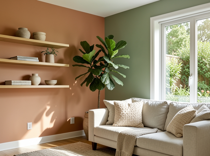
| Living Room | Cream White, Light Beige (Approachability) | Natural Wood Brown, Terracotta | Deep Green from real plants |
| Bedroom | Light Gray, Blue-Gray (Serenity) | Muted Blue, Warm Beige | Olive Green or Soft Sunlight Yellow |
| Workspace | Bright White, Oak Wood (Focus) | Forest Green, Stone Gray | Earthy Orange or Copper |
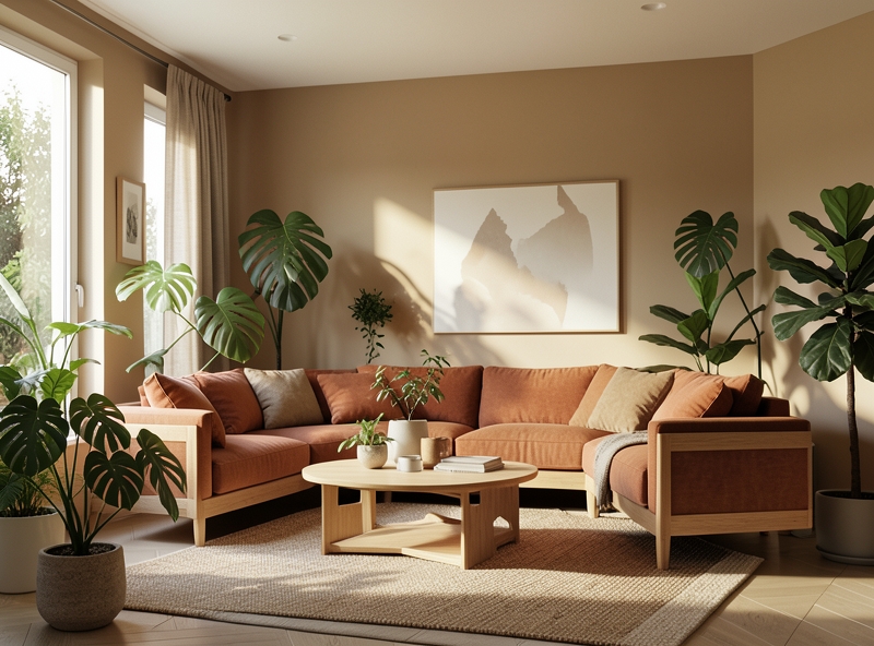
Living Room - A place for intimate stories: Here, I usually choose 60% in beige or cream white tones reminiscent of sea sand. It creates an expansive backdrop, making the room look significantly more spacious. For the next 30%, prioritize wood materials or terracotta-colored linen. And finally, the "soul" of the room lies in the 10% green. Instead of using green throw pillows, I recommend placing a large Monstera or Money Tree. The green from natural chlorophyll has a depth and changes with the light that no paint can imitate.
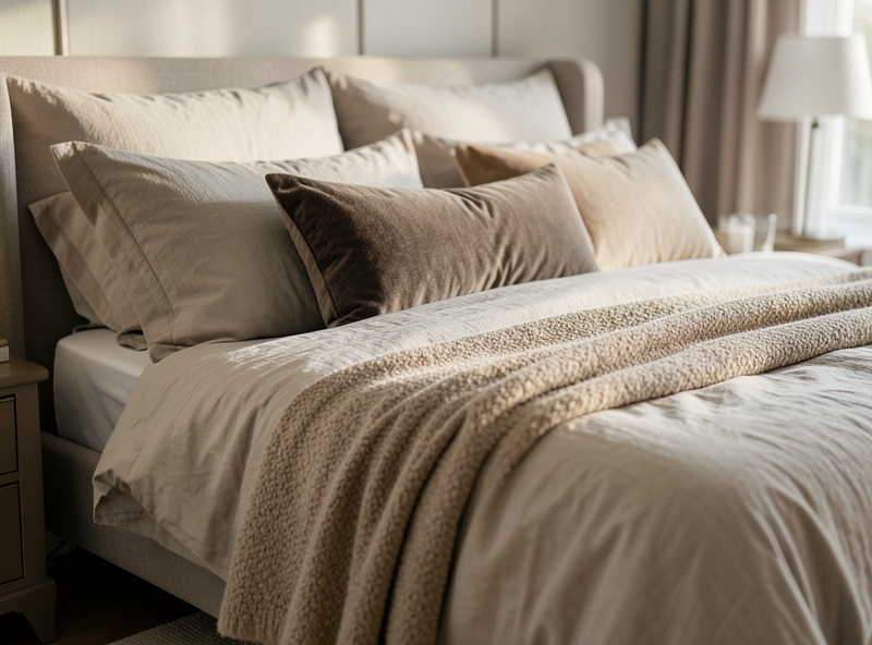
Bedroom - A peaceful quietude: To fall into a good sleep, our eyes need relaxation. Try using a light blue-gray tone (duck egg blue) for 60% of the wall area. The remaining 30% is the color of white sheer curtains or light brown bedding. The 10% accent should now be a few small air-purifying plants like Snake Plants or Peace Lilies. Their green color not only soothes the eyes but also brings a strange sense of peace.
Workspace - Absolute concentration: Do you know why modern offices often have many green plants? Forest Green at the 30% level (perhaps a feature wall in front of you or a bookshelf) helps reduce eye strain and increases creativity. With 60% white to maintain alertness, let the green sprouts of a small hydroponic plant on your desk "speak" for the remaining 10%.
Using greenery as this 10% accent is the "key" to completing the Biophilic picture. Plants are not static; they grow, sprout new leaves, and change shades with the seasons. That is "dynamic" color coordination—the thing that keeps your home full of the breath of life instead of being a soulless concrete block.
5. Summary
After hours of swirling through reports, deadlines, or the honking of horns in the street, returning to a Biophilic-inspired space feels like taking a deep breath in the middle of a primary forest after a long day stuck in an elevator. This art of color coordination is not merely about choosing green paint or placing a few potted plants in a corner. It is how we re-establish our instinctive bond with nature—something that the pace of modern urban life has sometimes unintentionally severed.
By applying a palette of earth, sky, and plants, we are creating a true energy "charging station." The core benefits this style brings do not just stop at the visual level:
- Psychological balance: Reduces nervous tension and helps stabilize the heart rate after external fluctuations.
- Increased focus: Soothing natural tones help the brain stay less distracted compared to overly vibrant colors or cold, white spaces.
- Sustainable lifestyle: Biophilic encourages the use of natural materials that rarely go out of style, helping you escape the cycle of short-term, wasteful decorative trends.
In reality, Biophilic is not a "trend" that comes and goes like the "color of the year." It is a philosophy of slow living, a long-term investment in mental health. Do not be too rigid with 60-30-10 color rules or try to perfectly replicate a photo on Pinterest. Everyone has their own "frequency" with nature: some find peace in the deep blue of the ocean, while others find security in the dark brown of aged tree bark.
"The most beautiful home is not the most expensive one, but the one that most clearly reflects the peace in your soul through the shades of Mother Nature."
My final piece of advice for you: Close your eyes and recall a moment when you felt most free in the midst of nature. Was it the color of early morning, the sunset glow, or a misty valley? Listen to that personal feeling and bring it into your home. Ultimately, paint can be changed, furniture can be replaced, but the feeling of "belonging" and "being healed" within your own nest is the most sustainable value that the art of Biophilic color coordination aims for.