1. Overview of the Scandinavian Style in Professional Bookshelf Decoration
You know, there are afternoons when I sit quietly in my living room, looking at the bookshelf and realizing that it isn't merely a "warehouse" for paper and ink. In the world of interior design, the Scandinavian style—also known as Nordic style—is like a breath of fresh air blowing into a living space. It is not ostentatious or elaborate, yet it has the ability to transform a crude shelf into an inspiring work of art.
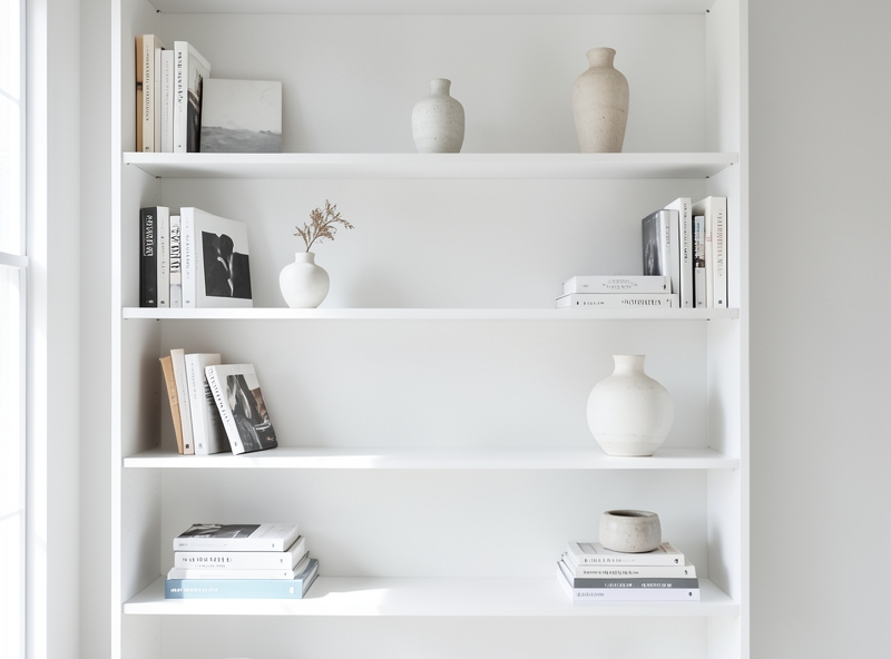
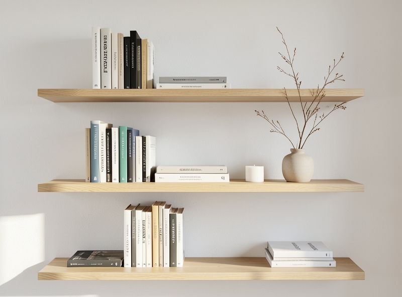
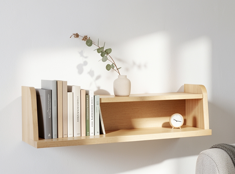
Fundamentally, Scandinavian is the crystallization of three elements: aesthetic beauty, minimalism, and functionality. Imagine it like the way a close friend of ours dresses; no need for flashy designer clothes, just a crisp white shirt and well-fitting jeans, yet looking at them reveals an irresistible elegance. On a bookshelf, this style prioritizes neutral tones like white, gray, or natural wood colors, helping our eyes "rest" after a long, stressful workday.
Why is this trend considered the pinnacle of "professionalism" in decoration? The answer lies in how it changes our mindset about storage. Instead of trying to cram every book we own onto the shelf, the Scandinavian style teaches us how to curate and create "breathing spaces." A professional shelf in this spirit usually possesses the following characteristics:
- Minimalism: Removing what is redundant, keeping only books that are truly valuable or have spiritual meaning.
- Functionality: Books must be arranged so they are easy to find and easy to retrieve, not just for looking at but for reading.
- Warmth (Hygge): Incorporating natural materials like wood, rattan, or a few small ceramic items so the space doesn't feel cold.
"In Scandinavian style, every gap on the shelf is as important as the book placed there. It is the art of moderation."
When applying this decorative approach, you will see that the bookshelf is no longer a separate object. It blends with natural light, with the wall paint, and with the very soul of the owner. That is why Scandinavian never goes out of style, because it aims for the most core values of life: simplicity and peace.
2. Core Principles: The Balance Between Color Palette and Negative Space
There was a mistake I made back when I first started struggling to decorate my workspace: whenever I saw an empty spot, I would "stuff" it with another book or a souvenir. As a result, the bookshelf looked no different from a miniature grocery store—cluttered and incredibly exhausting to look at. Later, I came to understand that the secret to a beautiful space doesn't lie in how many items you have, but in how you let them "breathe."
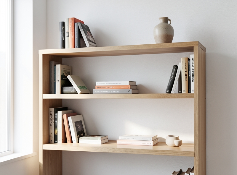
First, let’s talk about the foundation—the primary color palette for the shelf. I often compare color to the soul of a corner. Tones like pristine white, neutral gray, or light wood (oak, pine) are always "safe" yet extremely sophisticated choices. Why? Because they act as a perfect backdrop, yielding the stage to colorful books or small, charming decorative items. White helps the space feel several square meters larger, while light wood brings a warm, intimate feeling, as if you're sitting in the middle of a small forest.
But color alone isn't enough; the true soul of a refined shelf is "white space." Think of it this way: In a great piece of music, the rests are just as important as the high and low notes. If you fill 100% of the shelf area, the viewer's eyes will be overwhelmed, not knowing where to focus. When you bravely leave some corners empty, those very spaces unintentionally form a "frame," making the items next to them stand out and feel far more valuable.
"Empty space is not a waste of area; it is respect for beauty."
To help you visualize and implement this, you can refer to the distribution of visual "weight" in the table below:
| Element | Psychological Effect | Practical Decor Tip |
|---|---|---|
| White/Gray Tones | Creates lightness and modernity | Use as the paint color for the shelf or the wall color behind it. |
| Light-colored Wood | Enhances a cozy, natural feel | Add a small green potted plant to create vitality. |
| Negative Space (30-40%) | Reduces visual pressure, creates openness | Don't pack books tightly; leave open gaps between sections. |
I often advise my friends that when decorating a bookshelf, apply the rule of "less but better." Instead of stacking dozens of books vertically in the usual way, try placing a few horizontally, with an antique clock or a sprig of dried flowers on top. At this point, the surrounding empty spaces will serve to guide the gaze, making people pause to admire that item a little longer.
- Prioritize consistency: If your books have too many vibrant colors, try covering the spines with kraft paper or turning the spines inward (Neutral style) to maintain a minimalist color palette.
- Visual layering: Place heavy, bulky items at the bottom and keep the shelves at eye level airy and open.
- The power of odd numbers: Decorative groups of 3 or 5 items usually create a more natural balanced effect than even numbers.
Creating this balance isn't difficult; it just requires a bit of patience to experiment and observe. Remember, your home is a place for you to relax, so don't let overcrowded shelves keep your mind busy.
3. The Art of Coordination: Arranging Books and Decorative Items with Sophistication
Hey there, have you ever stood before a bookshelf packed with books yet felt like something was "missing," or conversely, that it looked too uniform and dry like a sterile library? In reality, arranging a bookshelf is much like telling a story. If every page looks the same, the reader will quickly get bored. The secret here lies in creating a visual "rhythm" using simple yet effective mix-and-match techniques.
Instead of standing all your books vertically in the traditional way, try shifting your mindset a bit. Place a few stacks of books horizontally interspersed with vertical sections. These horizontal stacks not only break the monotony but also serve as a perfect "base" for you to place a small memento on top. It creates resting points for the eyes, making the shelf look more airy and significantly more deep.
"A beautiful bookshelf is not defined by the amount of knowledge it holds, but by how it reflects the soul and sophistication of its owner."
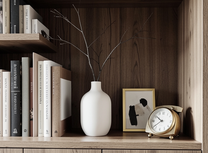
To add more vibrancy, don't forget the "companions." Imagine a minimalist ceramic vase in neutral tones placed next to vibrant book spines, or a classic desk clock nestled beside thick novels. The rustic feel of ceramics, the coolness of metal, or the softness of a small art piece will create a visually striking symphony of textures.
You can refer to the quick suggestion table below to start "enchanting" your little corner:
| Element | Decorative Effect | Quick Tip for You |
|---|---|---|
| Horizontal Books | Creates visual pauses, acts as a base. | Choose large, hardcover books. |
| Ceramic Vases/Flowers | Adds soft curves. | Choose minimalist designs so they don't overpower the books. |
| Small Art Pieces | Creates depth and layering. | Lean them against the back of the shelf or behind horizontal book stacks. |
| Clocks/Souvenirs | Evokes time and personal character. | Place them in spots with the best lighting. |
Finally, don't be too greedy with space. Leave some "breathing room" – small gaps on the shelf where light can filter through. It is those empty spaces where the beauty of sophistication truly speaks out. Keep experimenting and adjusting until you look at the shelf and feel it is truly "you," okay!
4. Breathing Life into Your Bookshelf with Natural Materials and Light
Have you ever stood before a packed bookshelf only to feel it was "stifling" and lifeless? I once had a shelf just like that, until I realized a bookshelf isn't just a place for storing knowledge—it's a mirror reflecting the owner's soul. To soften the dry appearance of those square book spines, I often tell my friends about the Scandinavian style, where minimalism and the breath of nature are celebrated in the most subtle way.
First, try adding a little "green." A tiny succulent with fleshy leaves placed atop a stack of old books, or a lush pothos vine cascading down from the highest tier. These green patches act like a visual rest, making the corner of the room feel significantly softer and more breathable. Don't be too fussy; it’s the rustic nature of terracotta pots or matte ceramics that creates a beauty that lasts over time.
"A beautiful bookshelf lies not in the number of books you own, but in how you allow nature to weave through the spaces between them."
Next, think about artisanal handicrafts. Instead of industrial plastic accessories, try finding some small rattan baskets to hold stationery or a few raw carved wooden statues. Wood and rattan materials bring a characteristic warmth that balances the coldness of modern items. I often compare this to wearing a cozy wool sweater in autumn weather—it makes your reading nook feel more "romantic" than ever.
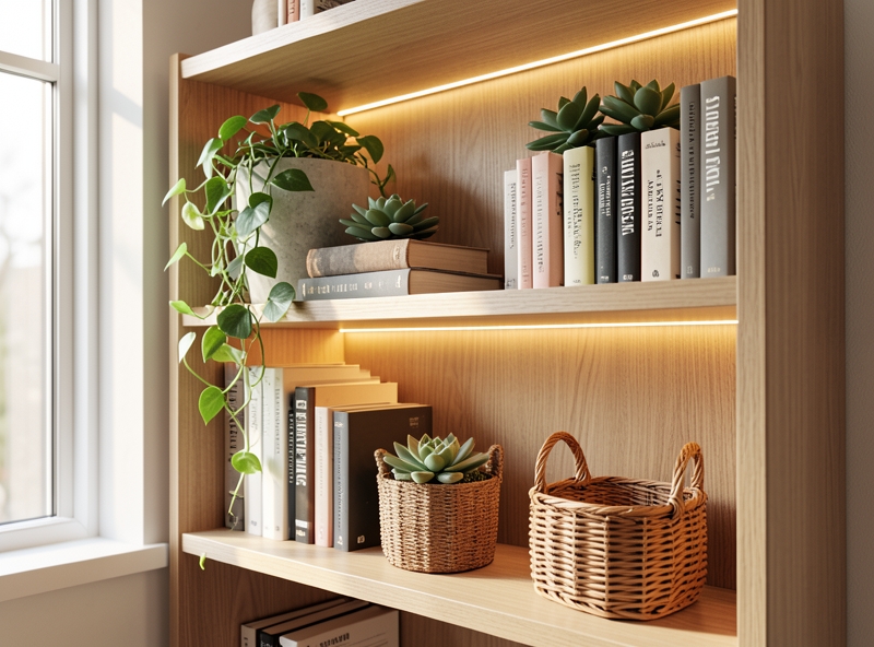
Finally, the key element to truly "breathe life" into it is light. If your bookshelf is lucky enough to be placed next to a window, make the most of natural light to highlight the wood grain and leaf colors. But when dusk falls, it is the discreetly placed LED strips along the shelf edges or a small desk lamp with warm yellow light (around 3000K) that will transform the shelf into a work of art.
Light isn't just for illuminating words; it creates highlights and shadows, casting onto handicrafts and making the depth of the bookshelf distinctly celebrated. To help you visualize and choose, I have a small comparison table below on how to coordinate these elements:
| Decorative Element | Visual Effect | A Quick Tip for You |
|---|---|---|
| Greenery (Succulents, Pothos) | Creates vitality, softens sharp edges. | Place plants in spots with indirect light to keep their color vibrant. |
| Rattan, Raw Wood | Brings warmth and coziness (Cozy). | Use rattan baskets to hide cluttered miscellaneous items. |
| LED Strips / Warm Light | Creates depth, luxury accents. | Hide the power cords neatly behind book spines to ensure aesthetics. |
As you can see, you don't need to be a professional architect; with just a bit of meticulousness and a love for natural things, you can completely transform an inanimate bookshelf into a peaceful "oasis" right inside your own home.
5. Summary
As you can see, creating a "standard Nordic" bookshelf isn't actually as difficult as it looks in those shimmering Pinterest photos. It all starts with choosing a neutral color palette as a foundation, limiting the number of items to create "breathing room" for the eyes, and finally, breathing life into it with natural materials like wood, ceramics, or a lush green branch.
Much like brewing a good cup of tea, arranging books requires a bit of patience. Don't try to fill every gap immediately. Let the shelf grow gradually along with your own experiences. A worn-out old book bought from an antique shop, or a small ceramic vase you picked up during a distant trip—everything has its own place.
I believe that taking the time to care for your bookshelf is more than just beautifying four walls. It is how we dialogue with ourselves and express our lifestyle to those who visit. Looking at how someone arranges their books, one can guess whether they love order or freedom, whether they are pursuing stillness or the vibrant colors of life.
"A bookshelf is a mirror reflecting the soul of the homeowner. Let it tell your story in the most authentic and sophisticated way."
Below is a quick summary of the core "ingredients" for you to easily implement today:
| Element | Scandi Formula | Benefits |
|---|---|---|
| Color | White, gray, light wood | Creates a sense of spaciousness and relaxation. |
| Layout | Rule of thirds and negative space | Avoids a feeling of suffocation and visual clutter. |
| Accessories | Greenery, scented candles, handicrafts | Adds warmth and a personal touch. |
Hopefully, with these small tips, you will no longer feel overwhelmed by messy piles of books. Start by clearing out one shelf, placing a few of your favorite books there, and feel the magical change that Scandinavian style brings to your living space!