1. The Importance of DIY Brand Identity and the Cost Optimization Challenge
Many small business owners are trapped in a disastrous illusion: brand is a luxury game only for large corporations with massive budgets. As a result, your product might be extremely good, but the packaging looks makeshift, the logo is patched together from free templates, and the communication message is messy. Customers glance past you in 3 seconds to choose a competitor with a more professional appearance, even though their internal quality is not necessarily as good as yours. That is the price to pay for the lack of a consistent identity system.
"Customers do not buy your product. They buy how that product makes them feel. And that feeling is 90% shaped by the external appearance before they even have a chance to experience the quality inside."
The concept of DIY Brand Identity was born as a solution to the survival challenge of small businesses and household businesses. This is not a makeshift patch, but a strategy of mastering your own core image through understanding target customers and applying minimalist, consistent design principles from logos, packaging to all sales materials.
By maintaining consistency from the logo on the label to the dominant colors of the packaging, businesses are accumulating trust assets. This intentional repetition helps position the brand deep in the minds of customers, turning an ordinary product into a tasteful choice, thereby allowing you to establish a premium price without facing resistance from buyers.
The biggest challenge for household businesses is always tight cash flow. However, pouring money into professional design agencies is not the only way. With next-generation supporting tools and the right design mindset, you can completely build a professional identity system with minimal cost. Look at the comparison table below to clearly see the efficiency of resource optimization:
| Comparison Criteria | Outsourcing Design | DIY Brand Identity Solution |
|---|---|---|
| Investment Cost | Very high (Large fixed cost) | Minimal (Almost zero when self-implemented) |
| Implementation Time | Lasts from several weeks to several months | Proactively adjust, complete immediately |
| Flexibility Level | Difficult to change after contract acceptance | Easily fine-tune based on customer feedback |
| Control Capability | Depends on the perspective of the external agency | Clings 100% to the spirit and core of the founder |
The core principle to remember: it does not need to be perfect from the start, but it must be consistent. A simple color palette of two main tones, a clean, readable font, and a minimalist logo used repeatedly across all touchpoints from business cards, paper bags to online avatars will create brand recognition power no less than that of big brands. The cost optimization challenge has been solved, the only remaining barrier is your own persistence and systematic thinking.
2. Defining Your Brand Core: The Stepping Stone to Shaping a Consistent Style
Thousands of small business owners are making a costly mistake: Burning money on a flashy logo but failing to answer their customers' core question: "Why should I choose you over your competitors?". When your budget is limited, you cannot use money to crush your rivals. The only weapon that helps you win is absolute consistency in the minds of your customers. Defining your brand core is about designing a unique "identity profile" that makes customers recognize you instantly amidst a chaotic sea of choices.
To shape a professional brand style without spending hundreds of millions of VND on advertising agencies, you only need to master the three foundational pillars below.
Pillar 1: Positioning Your Brand's "Three-Legged Stool"
A strong brand does not talk about their products; they talk about the solutions and emotions they bring to their customers. Establish these three elements yourself using highly practical sets of questions:
- Brand Personality: If your brand were a person, what would their personality be like? Are they a dedicated, serious expert (like financial or healthcare services) or a youthful, unconventional companion (like F&B or fashion brands)? Choose exactly 3 adjectives that describe your brand most accurately and stick strictly to them in every post and email sent to customers.
- Realistic Target Audience: Stop drawing customer personas with soulless demographic data like "Female, 25-35 years old". You need to dig deep into their pain points and hidden desires. For example, an organic bakery does not sell cakes to "people who like sweets"; they sell "peace of mind and a healthy lifestyle" to young mothers who are always afraid of their children consuming too much artificial sugar.
- Core Message: Write down a single positioning statement using the formula: "We help [Target Audience] solve [Biggest Pain Point] with [Unique Solution]". This will be the compass for all your communication content going forward.
"Customers do not buy what you make; they buy why you make it. Consistency between message and action is the shortest path to building trust."
Pillar 2: Scouting Competitors to Find Positioning "Gaps"
Before deciding what you will look like, you must know what color shirts your competitors out there are wearing. The goal of competitor research is not to copy them, but to find market gaps they have overlooked.
List your 3 most direct competitors. Visit their websites, fanpages, see how they write content, how they mix colors, and look at customer feedback in the review section. If all competitors in your industry are using safe, serious blue tones and formal writing styles, that is your opportunity to break through with a warmer color palette and a friendly, conversational tone, like a personal advisor.
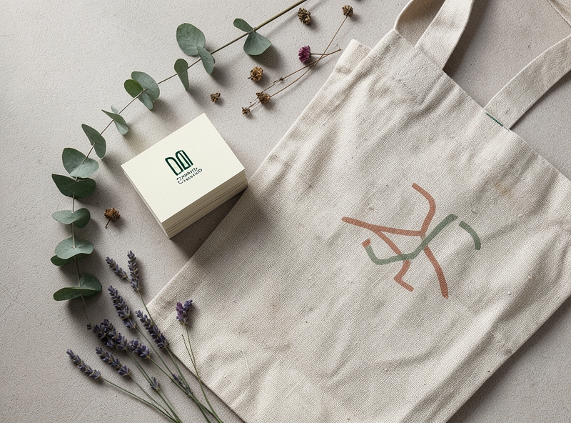
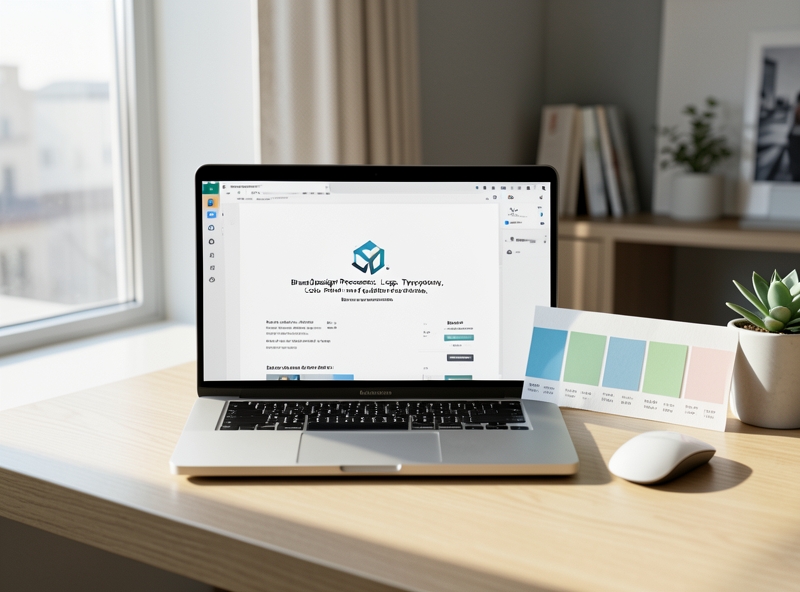
Pillar 3: Establishing a "Do-It-Yourself" Visual Identity System
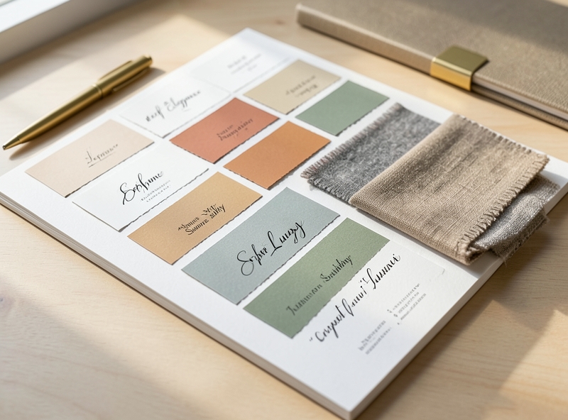
You can completely create a professional identity system yourself by applying basic visual rules. The two elements that have the strongest impact on the viewer's brain are Color and Typography.
1. The 60-30-10 Color Rule: Do not get greedy and cram in too many colors. Choose a limited color palette of up to 3 colors according to the golden ratio:
- 60% Dominant Color: Usually used for website backgrounds and large areas in store designs. Choose a neutral or soft tone.
- 30% Secondary Color: Supports the dominant color, creating depth for the brand (usually used for subheadings and frames).
- 10% Accent Color: The most outstanding color, used to stimulate action (call-to-action buttons - CTA, special offers).
2. Minimalist Typography Selection: Choose a maximum of 2 fonts for your entire brand. A serif font represents credibility, tradition, and luxury; or a sans-serif font represents modernity, minimalism, and transparency. Combining a Serif font for large headings (Heading) and a Sans-serif font for the body content (Body text) is a classic formula that never goes out of style.
To optimize operating costs, use the free yet extremely powerful tools below to design your own identity kit:
| Tool Name | Main Role in the Process | Tips to Maximize Efficiency |
|---|---|---|
| Coolors.co | Automatically generates and suggests beautiful pre-made color palettes. | Use the lock feature (Lock) on the colors you like and press Space to find the most compatible coordinating colors. |
| Google Fonts | The world's largest library of free fonts, supporting excellent display on all devices. | Prioritize fonts with various weights (Thin, Regular, Medium, Bold) like Montserrat, Playfair Display, or Inter. |
| Canva | Design communication materials and identity kits quickly. | Create a "Brand Kit" to save your chosen colors and fonts so that all employees design consistently. |
By persistently applying these identity filters across all touchpoints, from packaging and social media posts to your website, your small business will automatically take on a highly professional appearance. Customers will no longer see a makeshift, temporary shop, but a brand with personality, depth, and reliability.
3. Designing a Logo and Core Identity Using Free Tools
Millions of small business owners have burned tens of thousands of dollars on design agencies only to receive a cluttered, hard-to-use logo. Others self-patch images using free tools but lack systematic thinking, creating an inconsistent brand identity that makes customers doubt their professionalism at first glance. You do not need a massive budget to possess the image of a million-dollar brand. The secret lies in simplifying design and fully leveraging the power of technology.
"A bad logo makes you lose customers before you even have a chance to introduce your product. An outstanding logo is the anchor that positions your business's value in the minds of users."
To start building a sharp and consistent core brand identity yourself, you need to master the three most visual and powerful tools available today:
| Tool | Intended Use | Cost-Saving Alternative | Optimization Principles |
|---|---|---|---|
| Figma | Designing vector logos, original icons, and highly precise grid layouts. | Free forever for personal accounts, an excellent replacement for Adobe Illustrator. | Use basic geometric shapes (circles, squares, triangles) to combine, keeping the design grid balanced. |
| Coolors.co | Generating and locking brand color palettes automatically based on contrast algorithms. | Free to create palettes of up to 5 colors, exporting precise HEX color codes. | Apply the 60 - 30 - 10 color distribution rule to balance visuals. |
| Canva | Designing communication materials, packaging, invoices, and social media images based on available templates. | Use the free version or upgrade at a very low cost to manage your Brand Kit. | Only select minimalist templates, replacing all fonts and colors according to your predefined brand identity. |
Regardless of which tool you choose, the ultimate rule of modern logo design is simplicity and versatility. Test your logo through 3 strict filters: Does it display clearly when scaled down to a 16x16 pixel favicon on a browser? Does it stand out when printed in monochrome (black and white) on a thermal paper receipt? Does it pixelate when enlarged on a signboard? If the answer is no, strip away extra details, remove complex shadow effects, and keep only the most essential core.
To maintain consistency across all customer touchpoints, you must establish a basic Brand Guidelines. You do not need a hundred-page document; a small business only needs a single-page document capturing the following core specifications:
- Logo Standards: Clearly define the primary logo version (used on light backgrounds), the alternative logo version (used on dark backgrounds), and the required clear space around the logo to prevent text overlap.
- Color Palette: Specify the HEX codes of up to 3 primary colors. The dominant color (occupying 60% of the design area), the supporting color (occupying 30% for backgrounds and information hierarchy), and the accent color (occupying 10% reserved for call-to-action - CTA buttons).
- Typography: Limit to a maximum of 2 fonts. One strong, characterful font reserved for headings (Heading) and one highly readable sans-serif font for detailed content (Body text).
By strictly adhering to this shortened guide, all visuals from your fanpage profile picture, cover photo, and business cards to your product packaging will automatically align, creating a professional, synchronized experience that builds solid trust with your customers.
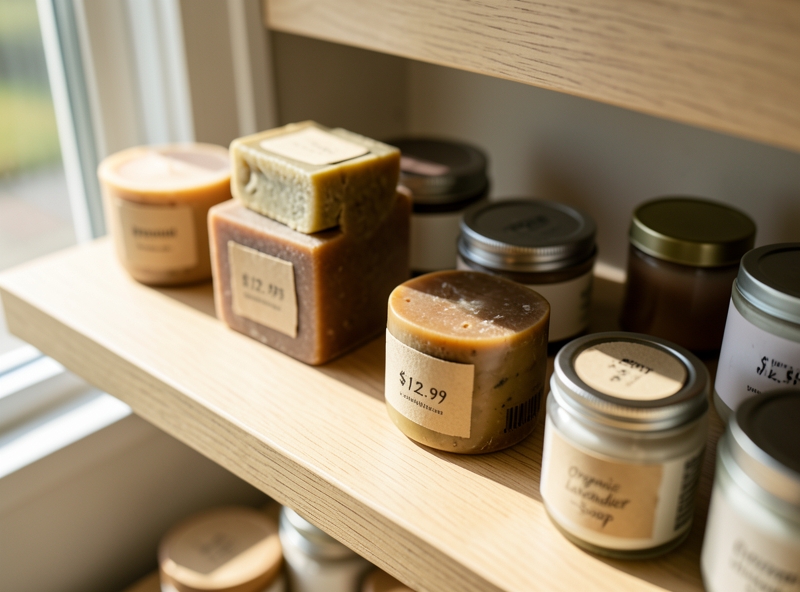
4. Synchronizing Product Packaging and Touchpoints with a Smart Budget
More than 80% of small businesses are putting themselves in a tight spot by trying to stretch their budgets to order tens of thousands of custom-designed carton boxes to get wholesale prices. The result is a backlog of inventory with dead capital locked up in boxes that they don't know when they will use up. Brand consistency is not measured by splashing money on flashy boxes from the start, it is shaped by smart design thinking and calculated synchronization at every customer touchpoint.
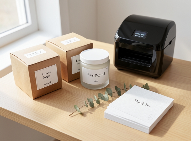
To optimize costs while maintaining professionalism, the best solution is the formula "Standard Blank Packaging + Defining Decals/Labels". Instead of ordering exclusive packaging with a minimum order quantity (MOQ) of up to thousands of pieces, buy ready-made blank boxes (kraft, E-flute corrugated cardboard, white Ivory paper boxes) in standardized sizes. Then, focus on designing and printing high-quality decal labels to paste over the blank boxes. This solution helps cut up to 60% of the initial investment cost, while allowing flexibility to change product information or promotional campaigns just by changing the label design.
| Comparison Criteria | Custom Offset Printed Packaging (Custom Production) | Ready-made Blank Boxes + Self-adhesive Labels |
|---|---|---|
| Minimum Order Quantity (MOQ) | Very high (usually from 1,000 - 3,000 boxes/size) | Extremely low (from 50 - 100 blank boxes, labels can be printed individually) |
| Initial Investment Capital | Large, easily causing working capital stagnation | Low, extremely fast capital rotation |
| Flexibility in Changing Designs | Poor (must use up the old batch of boxes or accept discarding them) | Very high (just need to reprint new label files at a cheap cost) |
| Inventory Cost | High due to having to store an extremely large number of boxes | Low, buying blank packaging on a rolling basis |
Besides materials, optimizing box size is also a hidden art. Shrinking the box size by just a few centimeters to fit the product perfectly not only helps reduce the cost of buying boxes, but more importantly, cuts shipping costs. Logistics providers always charge fees based on volumetric weight. A box with redundant space will indirectly erode the profit margin of each order through shipping fees.
"Customers do not buy the box, they buy the unboxing experience. It is the meticulousness and harmony in every small detail that creates the priceless emotion."
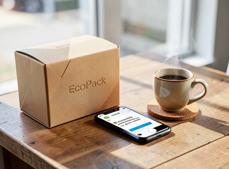
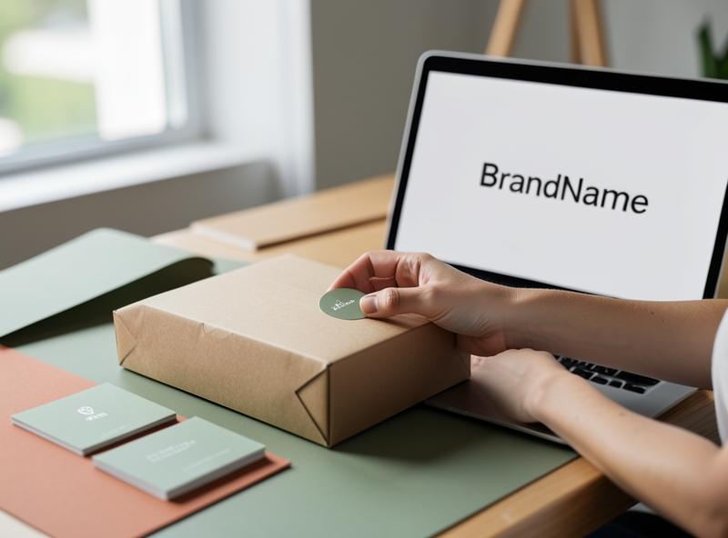
Synchronization does not stop at physical packaging but must be seamlessly extended to the digital space (Online). Make sure that when a customer transitions from seeing your avatar, social media cover photo to post templates on their phone, they must feel the same aesthetic "frequency" in terms of color, font, and design style of the box they will receive in their hands. Leverage intuitive drag-and-drop design tools to build a standard Brand Kit. You only need to set up the main color scheme and fixed fonts once, and all communication images will always follow the correct brand identity path without needing a professional designer on standby.
Finally, turn tiny offline physical touchpoints into automatic customer retention tools:
- Thank-you Card: Instead of using soulless pre-printed templates, design a thank-you card with the right brand colors, and insert a QR code leading directly to the product review page or VIP customer care group to receive offers for the next purchase.
- Sales Invoice: Utilize the footer of the thermal receipt from the POS machine to insert a brief, personality-filled brand message or a unique greeting instead of leaving it blank wastefully.
- Packaging Tape: Instead of regular clear tape, investing a little more in a roll of tape with the brand logo printed along it will instantly transform any ordinary carton box into a mobile brand ambassador throughout the shipping process.
By tightly connecting touchpoints from online to offline with a unified design language, small businesses can completely create a premium brand experience equivalent to large corporations, but at a much smarter and more practical cost.
5. Conclusion
Many small business owners still mistakenly believe that branding is a luxury privilege reserved only for large corporations with budgets of hundreds of millions or billions of dong. They accept a piecemeal appearance, blurry self-cropped logos, or different color schemes for each communication channel. In reality, customers don't leave because you don't have a million-dollar identity; they turn away because sloppiness creates a lack of trust. A successful Do-It-Yourself (DIY) brand identity is not measured by money; it is measured by meticulousness and maximum consistency.
"Consistency breeds familiarity. Familiarity breeds trust. And trust is the only thing that converts into sales without having to lower prices."
To set up a sharp brand identity yourself without relying on expensive agencies, businesses need to focus on the following three core steps:
- Define a single core message: Don't be greedy and talk about every strength. Choose a unique selling proposition (USP) that customers will remember immediately when they think of you.
- Synchronize basic visual touchpoints: Limit your color palette to 2-3 dominant colors, choose a maximum of 2 handwritten/print fonts, and apply them thoroughly from email signatures, invoices, and packaging to social media profile pictures.
- Standardize the brand voice: The way you respond to customer messages, write posts on your fan page, or draft documents must align with a consistent style – whether it is professional, friendly, or edgy and sharp.
| Comparison Factor | Piecemeal Identity (High Risk) | Consistent DIY Identity (High Efficiency) |
|---|---|---|
| Initial Cost | Almost zero (using free tools, done on impulse). | Low (only takes time to standardize the initial guidelines). |
| Customer Experience | Confused, doubting credibility because each channel displays differently. | Professional, trustworthy, easily recognized in a crowd. |
| Accumulated Value | None. Must be constantly torn down and rebuilt when changing operators. | Increases over time. Becomes an intangible asset of the business. |
Consistency and attention to detail in every small aspect always carry far more weight than flashy yet disjointed marketing campaigns. A clean, neatly packaged box, clearly branded with a logo label and accompanied by a matching thank-you card, always evokes stronger emotions than a polished website with empty customer service.
A brand is a living entity, constantly evolving alongside the development of business operations. Do not try to create a flawless, perfect brand identity from day one, only to fall into analysis paralysis. Start with simplicity, neatness, and standards. As the business begins to grow, cash flow stabilizes, and the customer base expands, that is the golden time to optimize, upgrade, and restructure the brand identity system to a more professional level.